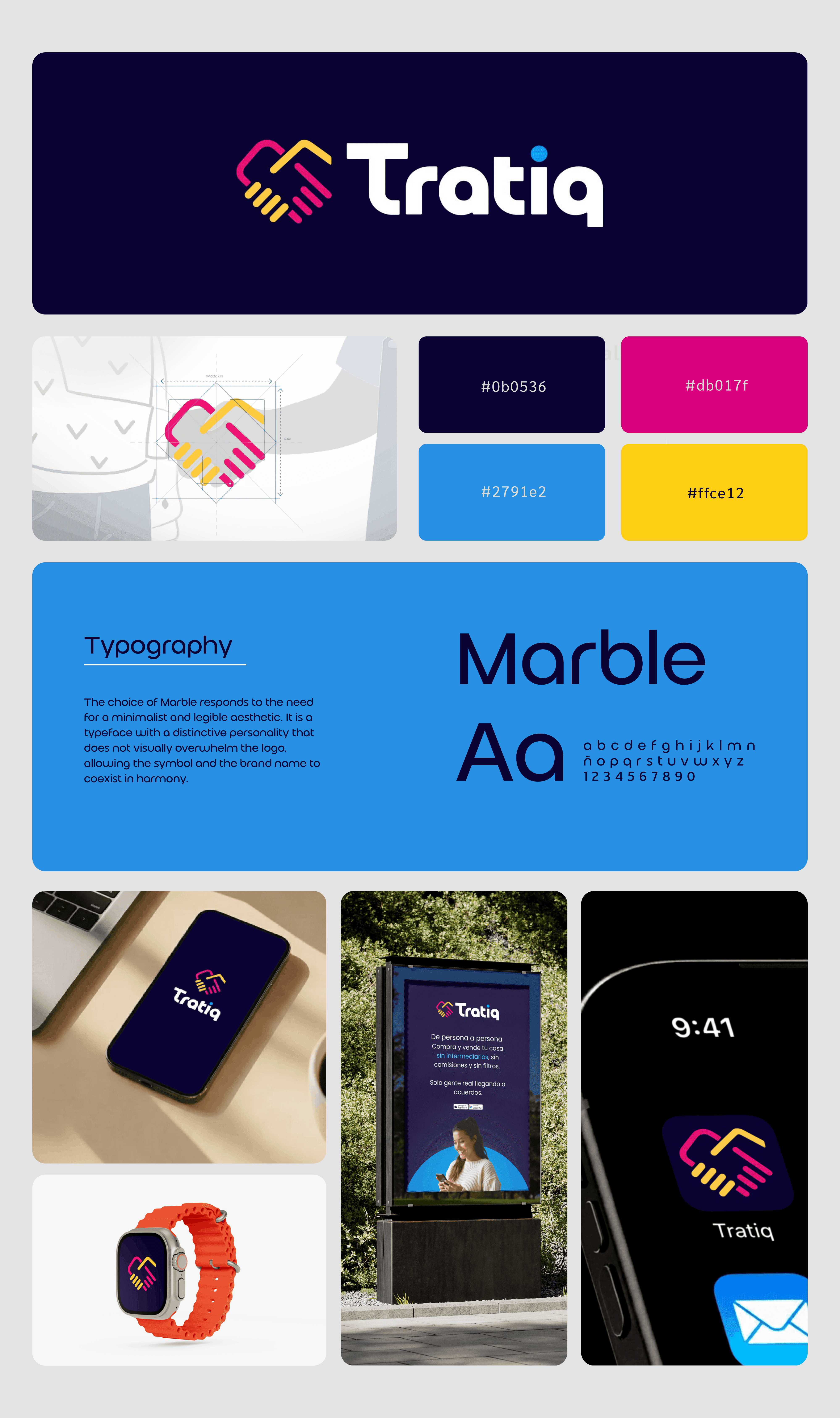
Tratiq is an app for buying and selling homes and properties directly between individuals. It’s a space where buyers and sellers meet, talk directly, and negotiate without heavy intermediaries. We had the privilege of designing the isotype for Tratiq, where the icon becomes the heart of the brand. It works on a dual semantic level: The intertwined lines symbolize a handshake, representing the direct connection between two people—capturing the moment of agreement, mutual trust, and barrier-free negotiation. The symmetry of the design reinforces Tratiq’s philosophy of equality, with no hidden hierarchies or commissions, emphasizing a balanced and fair relationship.
Country: Spain